


Mayonez
Mayonez is a typeface with rational structure and axis but softened with rounded contours and cupped serifs, getting as result a balance between seriousness and friendliness. The shapes have a soft appearance but without lacking definition.

In an attempt to give Cyrillic lowercase romans a fresh look, symmetrical serifs inherited from the versal tendency are mostly avoided thus getting simpler structures better related with the latin forms.

A more fluid structure influenced by calligraphy is proposed for the italic variants, in this case the uppercase letters adopted a simplified semiserif structure that works better with the lowercase letters. Also the figures are very different from the roman version and follow more faithfully the italic style.
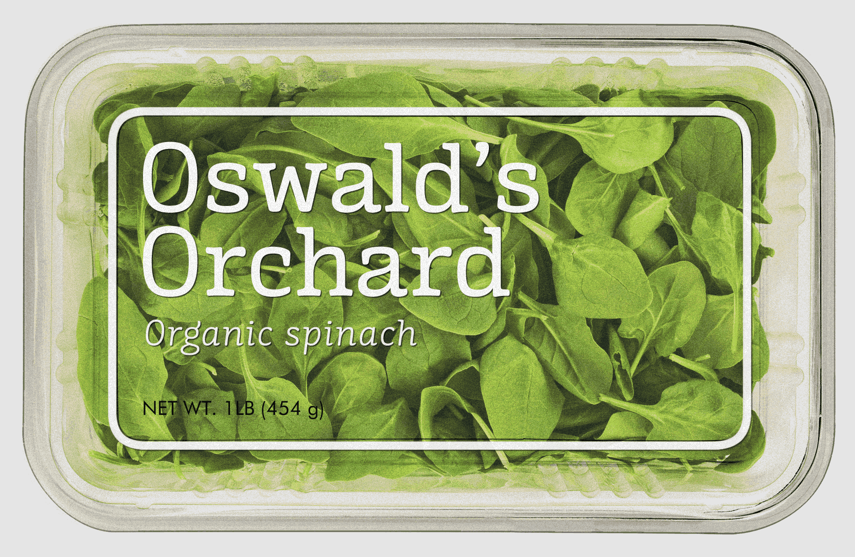
Mayonez is good for commercial and editorial uses like advertising, packaging and pages with showy headlines where a warm touch wants to be given, however its rational structure will make it behave very well if a more serious feeling is needed.

The ascenders height matches with the caps height and the descenders are short to allow lines to get closer and have more compact headlines.
Technical features
The font files are provided in .otf format which is supported by Mac OS X and Windows. This family supports Western European, Central European and Cyrillic. The OpenType features shown below are supported.

The whole family includes seven weights on roman and italic styles.

Basic ligatures.

Lining and oldstyle numbers and currency symbols.

Uppercase and lowercase ampersand.
Test the font
Buying options
Desktop and webfont licenses are available on Fontspring.com. For other kind of license or special requirements feel free to get in touch.


